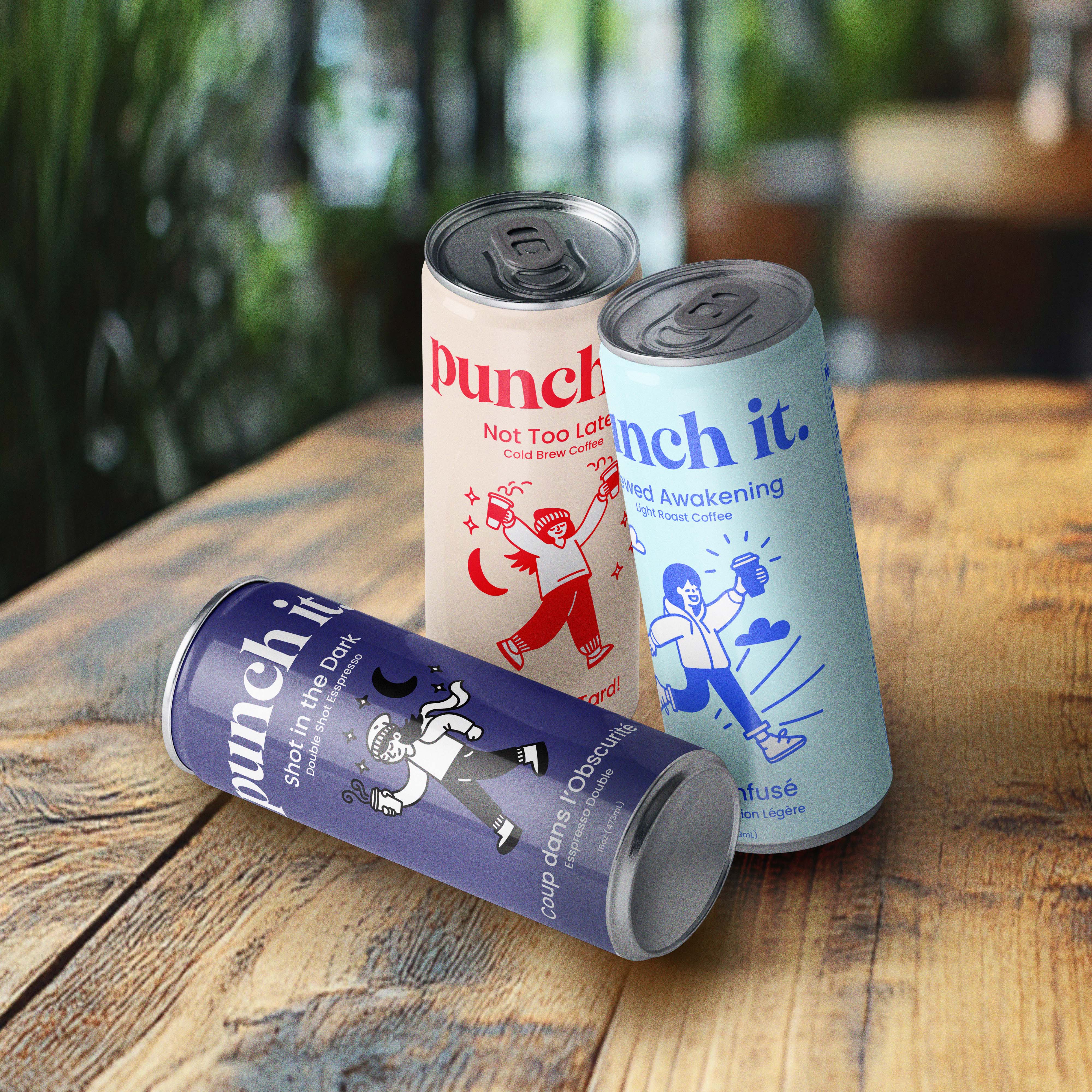
Punch it.
Punch It was designed to resonate with night owls and early risers, capturing the energy and motivation of caffeine. The concept focuses on blending bold visuals, vibrant typography, and playful illustrations to create a sense of movement and excitement.
The design process involved brainstorming, sketching, and experimenting with colour palettes and character styles to achieve a clean yet dynamic brand identity. The final packaging brings these elements together, using rich tones and lively illustrations to craft a cohesive design that stands out on the shelf while appealing to creative and ambitious audiences.
Overview
01.
Branding + Graphic Design
2 Weeks | November 2024
ILLUSTRATOR
PHOTOSHOP
02.
Illustrations + Dielines

Final Designs
03.

