Harmony
UX/UI Research + App Design
4 Months | August - December 2024
ROLES
Lead Designer
Researcher
Digital Marketer
TEAM
3 Designers
5 Developpers
FIGMA
ILLUSTRATOR
NOTION
LINEAR


01.
OVERVIEW
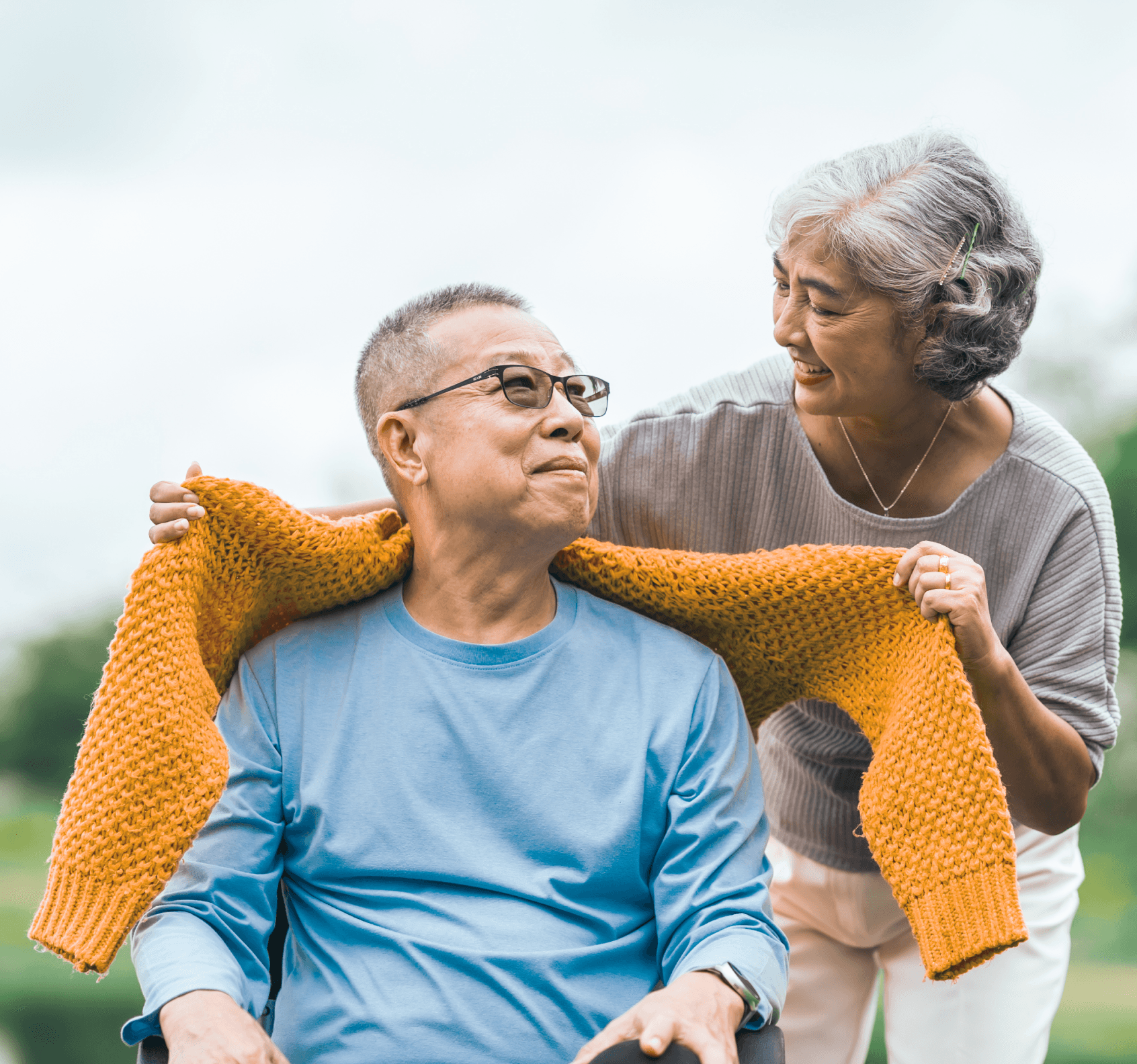
Harmony is an AI-powered caregiving solution designed to ease the daily challenges faced by caregiving teams, particularly within underrepresented communities. By streamlining task coordination, enabling real-time communication, and reducing stress, Harmony transforms how caregiving responsibilities are managed.
Inspired by the complexities of real caregiving experiences, this initiative focuses on delivering a seamless collaborative tool that empowers caregivers to bring organization, support and connection to their roles.

Order Medication Refills
Bring refill form
Metformin
500 mg, Take with a meal
10:00Am
Order Medication Refills
Bring refill form
Doctor Appointment
Annabelle
11:20AM
Outdoor Walk
Tina, Chelsea, Max
12:00Pm
Mood
Aug 15. - 1:21PM
Mood
SUPER AWESOME
Time of Day
Afternoon
What Penelope Noticed
He looks so happy after I took him for a morning walk and fed him his favourite breakfast.

Penelope Ng
Wife

Harmony Team - Behind the Scenes
02.
Understanding Caregiving needs
Caregivers face distinct challenges that influenced the development of Harmony:
OVERWHELMING RESPONSIBILITIES
Balancing caregiving with personal and professional obligations can be daunting. Managing appointments, medications, and daily tasks often becomes unmanageable.LACK OF CLEAR COMMUNICATION
Many family members struggle to stay informed about caregiving updates, leading to confusion and avoidable stress.EMOTIONAL BURDEN AND UNCERTAINTY
The caregiving journey can feel isolating, amplified by the emotional toll of unexpected changes and loss.
03.
SOLUTION
Harmony provides a centralized task management system that organizes schedules, tracks medications, and ensures nothing is overlooked or forgotten.
SIMPLIFYING OVERWHELMING RESPONSIBILITIES
1.
Harmony includes real-time communication tools, keeping caregiving teams and family members updated with instant notifications and shared notes.
IMPROVING COMMUNICATION
2.
Harmony builds connection and support through team collaboration features and access to shared resources, helping caregivers feel less alone.
EASING EMOTIONAL STRAIN
3.
04.
RESEARCH
4.1
UNDERSTANDING THE PROBLEM
Twelve caregivers from diverse experiences, age groups, and backgrounds shared common struggles, including time management difficulties, communication breakdowns, and emotional strain, particularly for those managing multiple caregiving roles. Secondary research supported these findings, highlighting the increasing acceptance of technology in caregiving. Scheduling, communication, and collaboration tools were identified as critical needs.
100%
Reported experiencing emotional challenges or feeling overwhelmed at some point in their caregiving jounrey.
92%
Participants relied on support systems like family, friends, healthcare aides, or community groups to reduce stress.
50%
Reported often struggling to balance responsibilities, stay organized, and manage daily routines.
Interviews with 12 caregivers provided valuable insight into daily challenges & needs
COMPETITIVE ANALYSIS
4.2

The competitive analysis revealed gaps in existing caregiving apps, such as the lack of comprehensive AI integration and personalization, while also highlighting their strengths in task management and communication. These insights shaped Harmony into a unique, well-rounded solution that addresses unmet needs and differentiates itself from competitors.
USER PERSONAS
4.3
These personas were essential in shaping design decisions, ensuring solutions remained aligned with caregiver needs while staying consistent, intuitive, and user-centered.


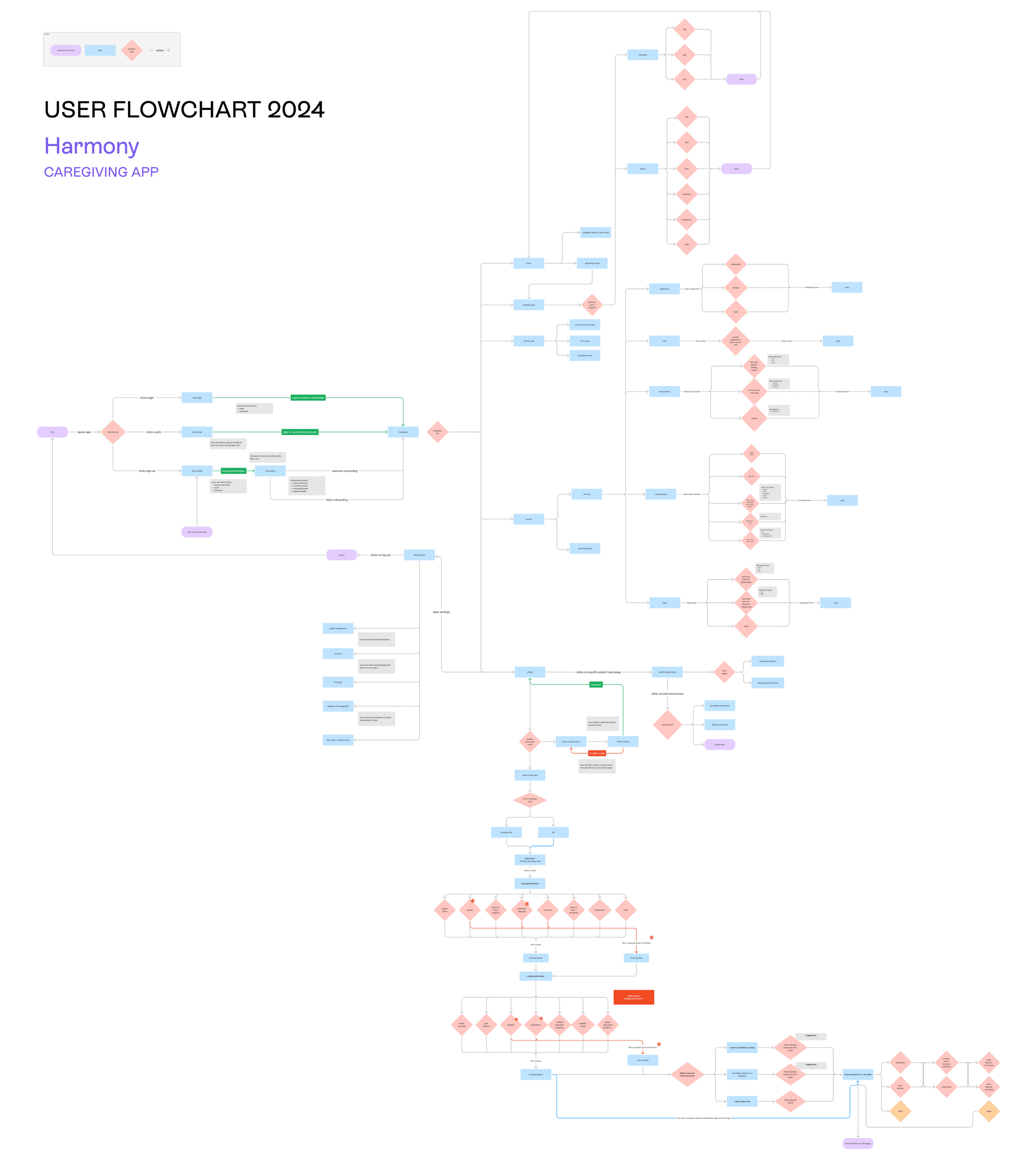
USER FLOWCHART
5.1
05.
DESIGN PROCESS
This detailed user flowchart was instrumental in mapping out the entire user journey within the Harmony app. By visualizing every interaction, decision point, and feature, it helped the team identify potential bottlenecks, streamline navigation, and ensure a seamless, intuitive experience for caregivers. This process also guided the prioritization of key features, ensuring they addressed the most critical caregiving challenges effectively.
DESIGN RESEARCH
5.1
Inspiration was drawn from apps that created a sense of trust, support, and collaboration for their users. By analyzing their design elements, user interactions, and visual language, key features were identified to evoke these feelings. This research shaped Harmony’s design, ensuring it not only addresses caregiving challenges but also fosters a reliable, supportive, and collaborative experience for its users.
TRUST

SUPPORT

COLLABORATION

LO-FI PROTOTYPE
5.2
A low-fidelity prototype was developed to outline the fundamental structure and functionality of Harmony. It served to map essential features, user interactions, and navigation flow, enabling early feedback and iteration before progressing to high-fidelity designs.


BRANDING & STYLEGUIDE
5.3
The branding of Harmony reflects its mission to support caregivers with calm, clarity, and connection. The primary purple palette, inspired by hues of jellyfish, represents balance and emotional stability, while the diverse secondary colours symbolize inclusivity and the varied caregiving experiences. Typography choices such as Rebond Grotesque and SF Pro offer a balance of structure and approachability, enhancing the design’s modern yet supportive tone. Combined with a clean iconography system, the branding creates an intuitive and cohesive experience, embodying Harmony’s commitment to simplifying caregiving and fostering a sense of support for its users.
Logo
Home
Calendar
Harmony
Journal
Profile
Navigation Bar
Home
Calendar
Harmony
Journal
Profile
Wordmark
Harmony
Your Partner in Care.
Brand Colours
Primary
purple/500
#7859EA
rgb(120, 89, 234)
hsl(253, 78, 63)
main purple
purple/400
#937AEE
rgb(147, 122, 238)
hsl(253, 77, 71)
purple/300
#AE9BF2
rgb(174, 155, 242)
hsl(253, 77, 78)
Secondary
red/light
#FE7258
rgb(254, 114, 88)
hsl(9, 99, 67)
red/dark
#5B0E00
rgb(91, 14, 0)
hsl(9, 100, 18)
pink/light
#FE83B0
rgb(254, 131, 176)
hsl(338, 98, 75)
pink/dark
#761739
rgb(118, 23, 57)
hsl(339, 67, 28)
yellow/light
#F7D844
rgb(247, 216, 68)
hsl(50, 92, 62)
yellow/dark
#4E412B
rgb(78, 65, 43)
hsl(38, 29, 24)
green/light
#6FC94F
rgb(111, 201, 79)
hsl(104, 53, 55)
green/dark
#19370E
rgb(25, 55, 14)
hsl(104, 59, 14)
blue/light
#7F99DD
rgb(127, 153, 221)
hsl(223, 58, 68)
blue/dark
#091E54
rgb(9, 30, 84)
hsl(223, 81, 18)
100
#1E1E1E
rgba(30, 30, 30, 0.75)
hsla(0, 0, 12, 0.75)
75
#1E1E1Ebf
rgba(30, 30, 30, 0.75)
hsla(0, 0, 12, 0.75)
50
#1E1E1E80
rgba(30, 30, 30, 0.5)
hsla(0, 0, 12, 0.5)
10%
#1E1E1E1a
rgba(30, 30, 30, 0.1)
hsla(0, 0, 12, 0.1)
15
#1E1E1E26
rgba(30, 30, 30, 0.15)
hsla(0, 0, 12, 0.15)
Black
Typography
ES Rebond Grotesque
Medium
SF Pro
Regular
Medium
Semibold
Heading 3
Font Size: 23px
Line Height: 120%
Heading 2
Font Size: 28px
Line Height: 120%
Heading 1
Font Size: 33px
Line Height: 120%
Body Copy
Font Size: 16px
Line Height: 120%
Font Weight: Light
Body Copy
Font Size: 16px
Line Height: 120%
Font Weight: Regular
Body Copy
Font Size: 16px
Line Height: 120%
Font Weight: Medium
Body Copy
Font Size: 16px
Line Height: 120%
Font Weight: Semibold
Subtitle
Font Size: 16px
Line Height: 120%
Font Weight: Regular
Subtitle
Font Size: 16px
Line Height: 120%
Font Weight: Medium
Subtitle
Font Size: 16px
Line Height: 120%
Font Weight: Semibold
Heading 4
Font Size: 19px
Line Height: 120%
06.
FINAL DESIGNS
The final designs for Harmony tackle the challenges caregivers face, such as managing multiple responsibilities, staying organized, and maintaining clear communication. An interactive calendar, personalized notifications, and AI-powered assistance streamline caregiving tasks and reduce stress, while tools for health tracking and team collaboration address gaps identified in competitive analysis. These solutions ensure Harmony delivers a comprehensive and supportive experience for caregivers navigating complex routines.

07.
PROMOTIONAL MATERIAL DESIGNS
Every piece of Harmony’s promotional material was designed with purpose to create a sense of connection, trust, and care for caregivers. From thoughtfully crafted business cards and brochures to PVC cards, a dynamic landing page, and an inviting social media presence, each element was created to bring Harmony’s mission to life. More than just branding, these materials serve as a bridge between caregivers and the support they deserve, making sure Harmony feels as personal and reassuring as the care they provide every day.
PRINTED MATERIALS
7.1
Building on Harmony’s promotional materials, a range of printed designs was created to bring the brand to life in a more personal and tangible way. From business cards and brochures to PVC cards, each piece was thoughtfully designed to communicate key messaging with clarity and impact. More than just informational tools, these materials help strengthen connections, making Harmony’s presence feel both accessible and meaningful.
Business Cards

Brochure

PVC Cards

LANDING PAGE
7.2
Harmony’s landing page is designed to be clean, intuitive, and visually engaging, with the goal of encouraging app downloads, showcasing its purpose, and building trust with caregivers. Every detail is crafted to create a seamless experience, making it easy to understand how Harmony can bring support and simplicity to caregiving.

BUILDING A COMMUNITY
7.3
Harmony’s Instagram presence was designed to foster a sense of community and transparency, offering a behind-the-scenes look at the journey from concept to creation. Weekly reels documented the development process, capturing the evolution of the app and the dedication behind it. Posts highlighted key milestones, values, and awareness campaigns, creating a space where caregivers could connect with the mission and vision of Harmony in an authentic and meaningful way.
Reels

Posts
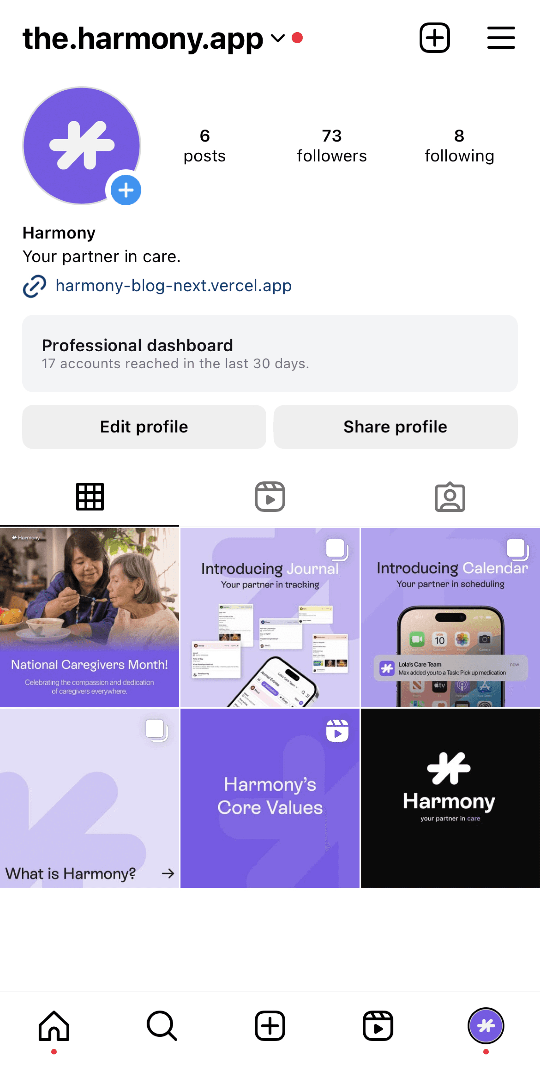
National Caregivers Month!

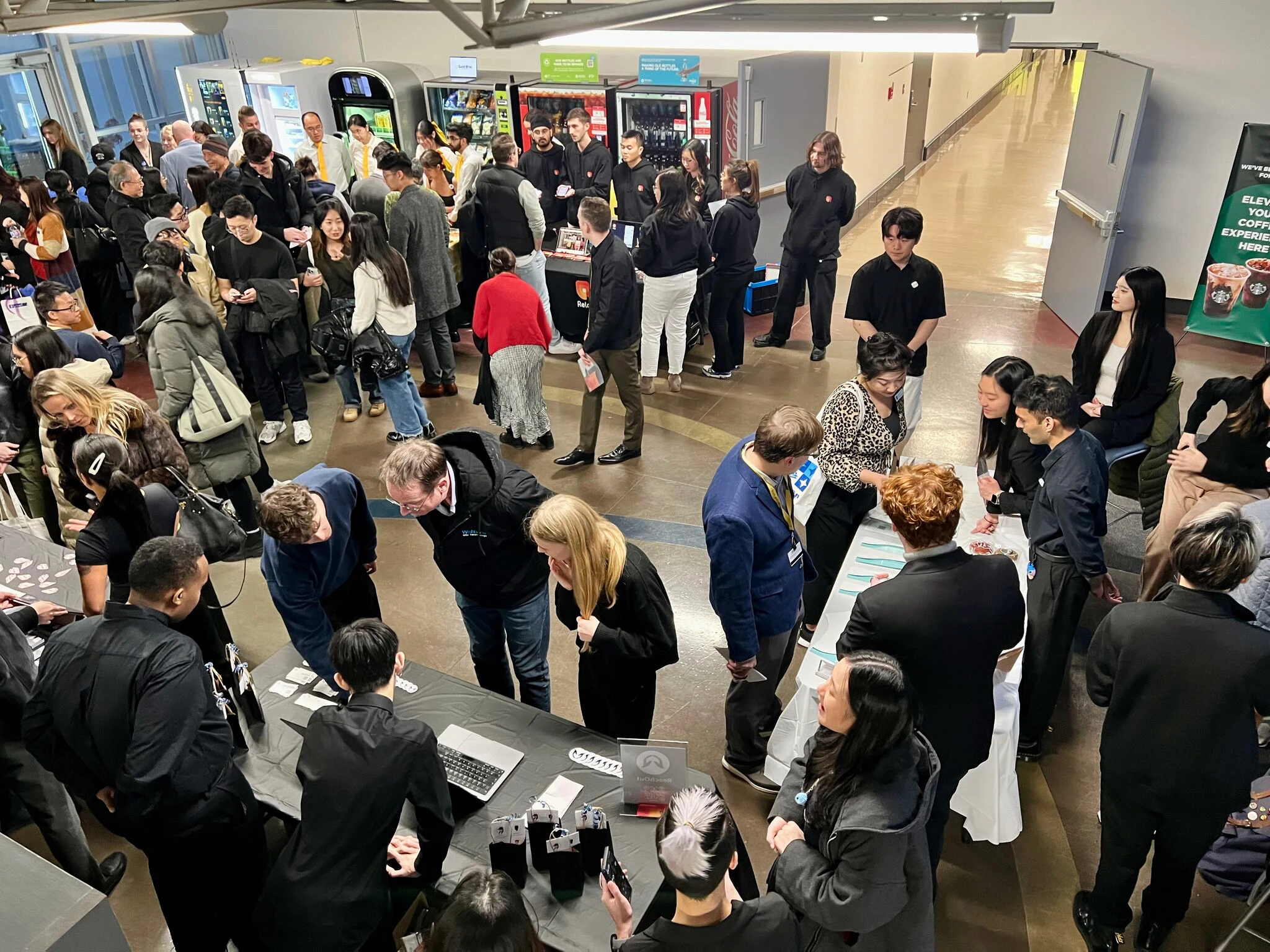
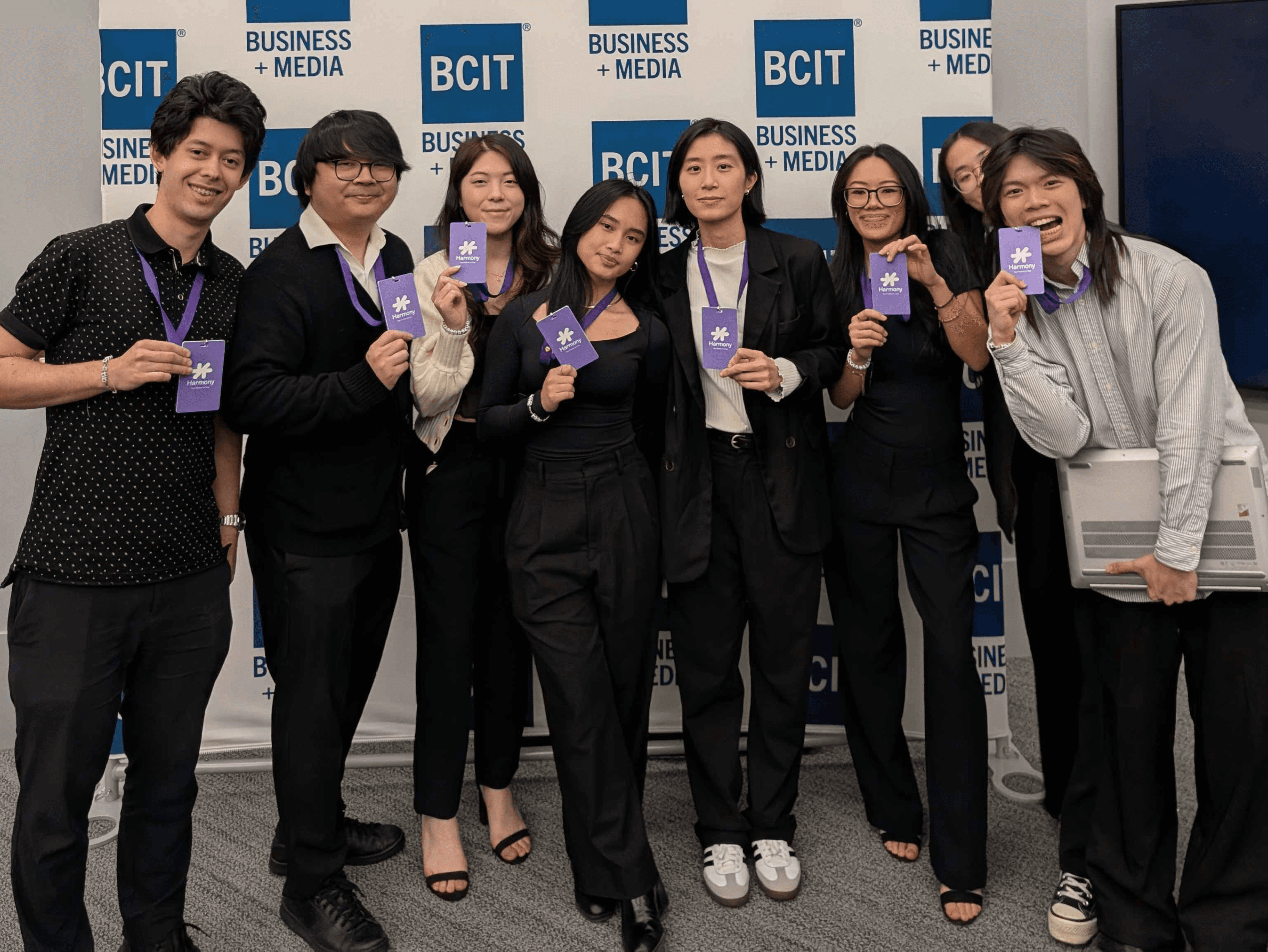
D3 / FSWD Annual Student Design & Technology Showcase
On December 6th, 2024, Harmony was presented at BCIT’s Annual
D3 / FSWD Student Design & Technology Showcase, an event that highlights innovative digital solutions aimed at addressing real-world challenges.
This year’s showcase focused on leveraging Artificial Intelligence to support underrepresented communities and businesses, bringing together students, industry leaders, and policymakers. Through insightful discussions, the event highlighted how technology can
drive meaningful change in real-world challenges.
Among ten teams, Harmony placed second, earning recognition for its thoughtful design and impact. The event was an opportunity to share Harmony’s mission with a wider audience and connect with those who truly understand the challenges caregivers face.
With the support of influential community members, including the Mayor of Burnaby, BCIT faculty, members of the Legislative Assembly, and key industry professionals, the showcase became a meaningful moment of recognition, reinforcing the importance of creating technology that makes a real difference.


THE JOURNEY & IMPACT
Harmony is more than just an app; it represents a commitment to supporting caregivers as they navigate the emotional and practical challenges of caregiving. By addressing key difficulties such as organization, communication, and task coordination, it provides solutions that go beyond functionality to create a sense of connection and trust.
Harmony’s design focuses on empathy and inclusivity, ensuring it meets the diverse needs of caregivers while encouraging collaboration within care teams.
In addition to simplifying caregiving tasks, Harmony allows families to focus on what matters most, creating meaningful moments and providing care with confidence.
Its thoughtful design and user-centric approach make caregiving less overwhelming, helping families achieve balance and peace during difficult times. Harmony demonstrates how technology can ease burdens while maintaining the human touch in caregiving.

thanks for reading! 💛
back to top